11. December 2020
by Johannes Weigend & Karl Herzog | 632 words | ~3 min read
software ekg software ecg covid-19 javafx data science data analytics
CW 50: Analyzing COVID-19 data with Software-ECG COVID-19 Edition
In this series of blogs we are looking at the current figures of the COVID-19 pandemic with Software-ECG. It is a free time series analysis tool originally developed for time series analysis for system analysis of computer problems in distributed systems. With its COVID-19 edition, QAware has adapted the tool so that the current data from the data hub of the University of Oxford (Our World in Data - OWID) are automatically loaded and immediately available for analysis. More information about Software-ECG and download links can be found here:
https://blog.qaware.de/posts/software-ekg-covid-19-edition/
Note: The German translation for ECG is EKG (Elektrokardiogramm). We are Germans, therefore we use the names “Software ECG” and “Software EKG” as synonyms.
Software-ECG ist build on Open-JDK and JavaFX. It leverages the power of a compiled language with a native Rich Client Framework.
Last weeks we compared the situation in Europe and in China and discovered interesting anomalies in the data on Russia, Ukraine and Serbia. This week we are going to compare Europe with South America. During the summer months of 2020 the pandemic paused throughout Europe. This applies to all countries except for Russia.

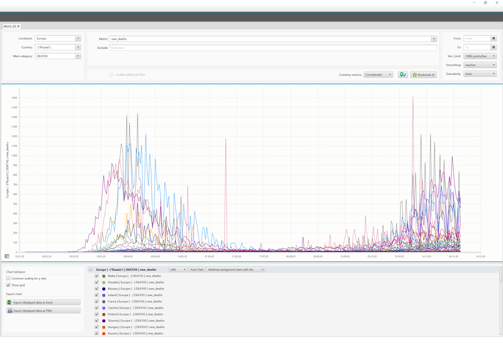
Daily number of deaths in Europe (excluding Russia) related to COVID-19
The graph displays the daily number of deaths in European countries excluding Russia. To filter out Russia, the expression -(*Russia*) is used in the country field. This syntax is taken from the Lucene Query Language. All ECG queries are Lucene queries against an Apache Solr NoSQL database. The strong oscillation of the curves can be observed in a weekly rhythm for all countries. While the maximum is on Tuesdays, the minimum can be observed on Sundays. The reason for this might be that new cases from the weekend are usually reported late. This anomaly affects all countries. Except for Russia the number of deaths decreased and almost reached zero in summer. In autumn however, the second wave has started in Europe. In Software-ECG COVID-19 Edition you can create an aggregated view of all these values. The result will look like this:
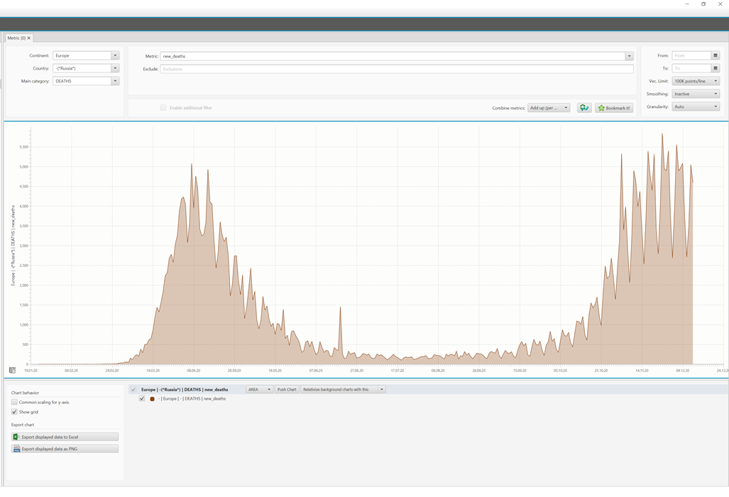
Total number of deaths in Europe related to COVID-19
The seasonal component cannot be ignored as it is not surprising for a disease that has the same transmission as the seasonal flu. Now, we would like to ask the following question: Can the same behavior also be seen in South America? Let us surprise you:
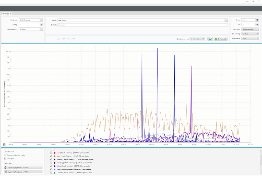
Daily number of deaths in South America related to COVID-19
A wave is most likely to be seen in Brazil (brown line) during the winter months of the year. However, the number of cases and the number of deaths is rising there again although summer is just around the corner. In some countries there are significant outliers in the curves. Such data anomalies probably are due to adjustments and corrections that were combined into one corrected value later. In sum, it looks less like a wave than a continuous event. For this purpose, you can add up all curves with the Combine Metrics -> Add up (exact) function of the ECG:
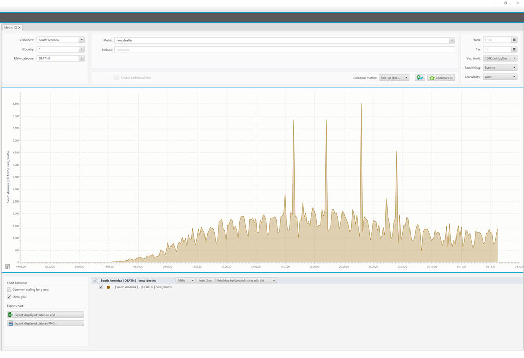
Total number of deaths in South America related to COVID-19
It would certainly be nice if the curves of the northern and southern hemisphere were the same. Then, you could flee from the virus by travelling. However, the data do not support this. In Brazil it is summer now and, of course, it is more pleasant there than in Europe at the moment. However, you will still be confronted with COVID-19 there.