03. December 2020
by Johannes Weigend & Karl Herzog | 685 words | ~4 min read
software ekg software ecg covid-19 javafx data science data analytics
CW 49: Analyzing COVID-19 data with Software-ECG COVID-19 Edition
In this series of blogs we are looking at the current figures of the COVID-19 pandemic with Software-ECG. It is a free time series analysis tool originally developed for time series analysis for system analysis of computer problems in distributed systems. With its COVID-19 edition, QAware has adapted the tool so that the current data from the data hub of the University of Oxford (Our World in Data - OWID) are automatically loaded and immediately available for analysis. More information about Software-ECG and download links can be found here:
https://blog.qaware.de/posts/2020-11-11-software-ekg-covid-19-edition/
Note: The German translation for ECG is EKG (Elektrokardiogramm). We are Germans, therefore we use the names “Software ECG” and “Software EKG” as synonyms.
Software-ECG ist build on Open-JDK and JavaFX. It leverages the power of a compiled language with a native Rich Client Framework.
In our last week’s blog we took a look at the current situation in Europe. We saw that the second wave is already breaking in Europe. During last week this trend seems to continues. The number of people tested positive is decreasing significantly in France (black line), Italy (top green line), and Great Britain (top purple line).
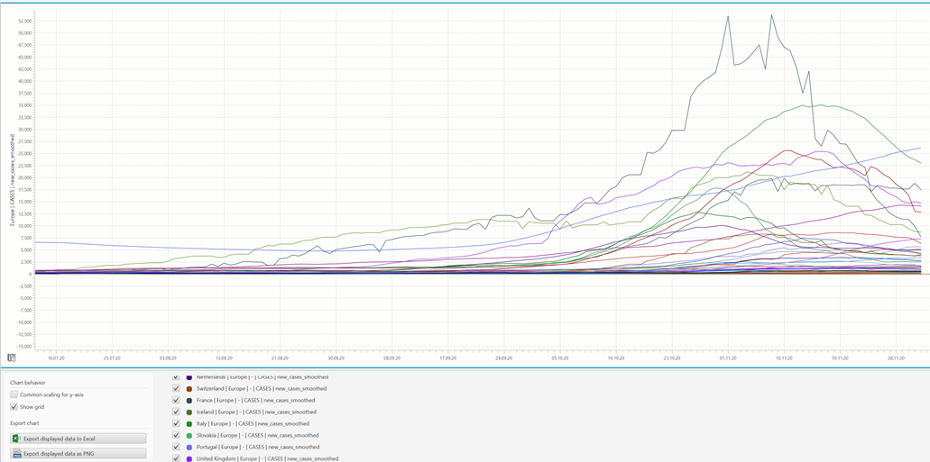
The second wave in Europe
But there are some countries where the graphs behave differently. These are Russia, Serbia and Ukraine. To analyze these countries exclusively you can use the filter query “Russia|Serbia|Ukraine” and zoom into the period of time for the second wave only. In these countries the positive test numbers are growing linearly. Neither can we see the typical increase at the beginning nor any flattening at a later point in time. We might assume that the data is gathered in a different way than other EU countries do.
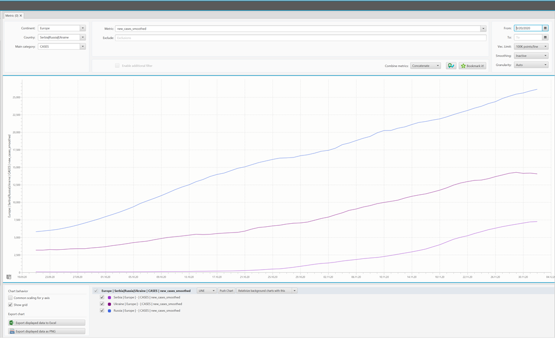
However, Russia, Serbia and Ukraine show an almost linear growth
A possible explanation for this could be these countries are currently ramping up their testing capacities in a linear way while the infection rate is remaining constant. If we had the same metrics as in the EU, we could easily demonstrate this by analyzing the number of tests and the infection rate. But these metrics are not published. The relevant fields in the CSV file from Our World in Data are empty for Russia, Serbia and Ukraine.
Now let us take a look at countries outside of Europe and analyze China. This country also has a very interesting chart because the second wave in China looks like this:
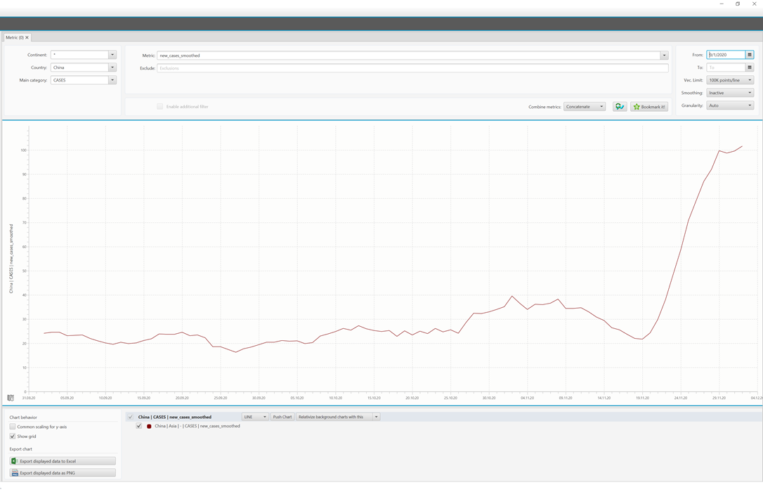
The second wave in China
The chart shows the number of new cases since September 2020. Make sure to look at the scale: Starting from 20 cases per day, it has now reached 100 cases per day.
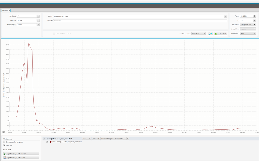
People could get nervous when they see the number of people tested positive is rising again. Do not get nervous, though! If you take a closer look at the same chart and change the start date to 1/1/2020, you can display both waves in a single chart. Now you will not see any second wave at all.

First and second wave in China
China does not report any test numbers. So, just looking at the isolated numbers of the reported positive cases is useless. You do not have any reference point if you do not know how many people are actually ill or have been tested. It might seem that in China the pandemic is over. People go to parties, concerts and do normal activities again. It would be very interesting, however, if we were able to take a look at the same test metrics (number of tests, positive rate) which are available for Europe.
We wanted to demonstrate that it is easy and fun to analyze the current COVID-19 situation with the latest available data in Software-ECG COVID-19 Edition. Feel free to download the tool and draw your own conclusions for your country, region or even all contries worldwide!